View project
Ta7wila
Doha, Qatar · 2025
Branding
Overview
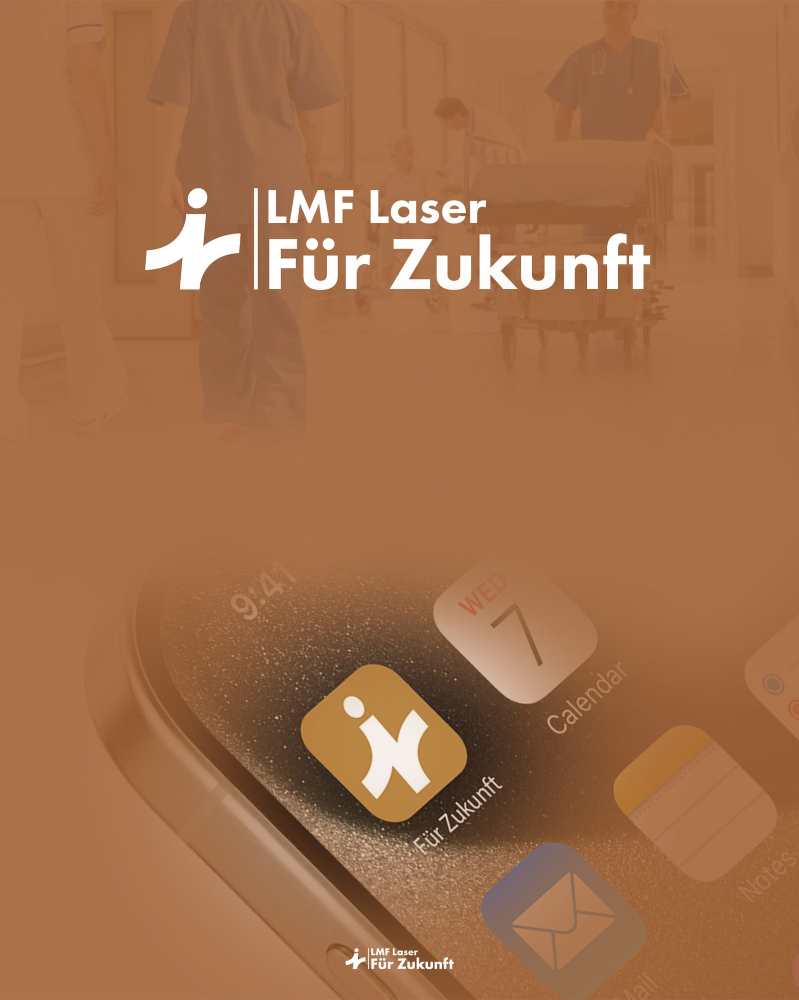
A complete visual identity system for a premium German laser-treatment center. The brand mark fuses three ideas — a medical cross, a figure with a raised arm, and the letter Z for Zukunft ("future") — into a single confident symbol that signals precision, care, and progress in one glance.
Position a clinical laser practice as warm and human-first without losing the precision the category demands — and ship a brand book robust enough to govern everything from signage to social posts.
We led with a refined gold-and-cyan palette that reads warm in print and crisp on screen, paired with Futura's geometric clarity. The brand book covers mission, logo construction, safe zones, color rules, typography, social templates, and stationery in a single source of truth.
A consistent visual language deployed across the clinic, web, print and social — anchored by a brand book the team can hand to any agency or printer with confidence.
Concept
The symbol layers three ideas into one. A medical cross stands for clinical care. A figure with a raised arm stands for the patient — confident, in motion, restored. The letter Z anchors the brand to Zukunft, the German word for future. Merged together, the three shapes resolve into a single lowercase ‘i’ that finally feels like the practice it represents.
Color palette
A grounded gold-and-clay palette carries the warmth of patient-first care, balanced by a calm cyan and a soft off-white that bring clinical precision to print and screen. The four colors are intentionally limited so every touchpoint stays unmistakably LMF.
Brown
#A36437
Light Brown
#CA954A
Grayish Cyan
#A7A8AB
Off White
#F3DED4
Typography
Futura is the sole typeface across the system — chosen for its geometric clarity, neutral confidence, and excellent legibility at any size. Three weights cover the full hierarchy: Bold for headlines, Medium for sub-heads, and Book for body copy and longform reading.
Futura Bold
AaBbCc 123
Futura Medium
AaBbCc 123
Futura Book
AaBbCc 123
Logo system
The logo is governed by a tight system: a primary horizontal lockup, a stacked alternate for square placements, a measured safe zone built from the head of the symbol, and a do's-and-don'ts page that prevents misuse. The mark never stretches, never tilts, never recolors.
Brand in the wild
The system was rolled out across social templates, stories, and profile assets in a single sprint. Every surface uses the same palette, the same typeface, the same lockups — so the brand reads as one voice whether you meet it on Instagram, in print, or at the clinic door.
More from the brand book
Related projects
We'd love to hear about it. Tell us where you are, where you want to be, and we'll map the rest.
Start a project