View project
Ta7wila
Doha, Qatar · 2025
Branding
Overview
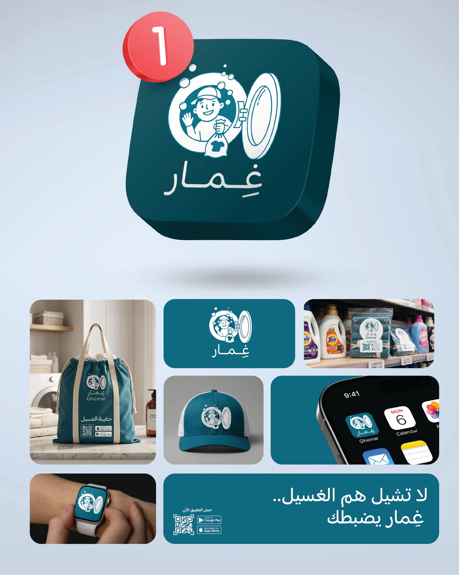
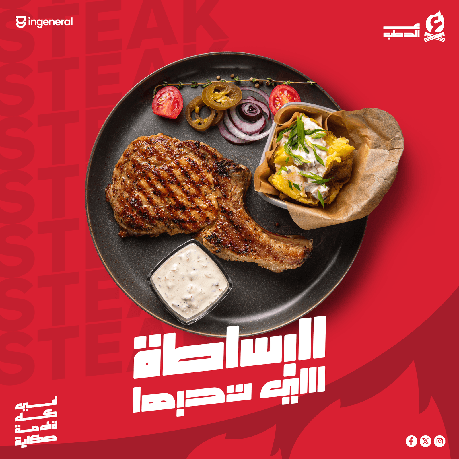
A full visual identity for ‘Al-Hatab’ (‘On the Firewood’) — a wood-fired grill restaurant whose entire promise is meat cooked over real wood, not gas. The mark fuses a flame with two crossed logs, with a custom Arabic wordmark that reads as carved-in-iron. Fire red on charcoal black, with white for breathing room.
The grill-and-BBQ category in the region is crowded with the same set of visual cues — generic flame icons, brown wood textures, sepia photography. Al-Hatab needed a mark that owned ‘fire’ as a single visual idea, an Arabic wordmark with real character, and a system that survived on a newspaper ad, on a delivery banner, and on a phone screen.
The whole identity orbits one mark: a stylised flame above two crossed logs, paired with a custom Arabic wordmark built from heavy geometric strokes. Fire Red #d92032 carries the signature; black does the heavy lifting; white opens up the breathing room. Every poster, every social post, every newspaper feature uses the same three colours.
Al-Hatab now has a complete brand kit — primary logo, stacked alternate, monochrome variants, the firemark icon for small uses, a social grid system, and a newspaper-style feature template. The red-and-fire-mark combination is recognisable from the other side of the street.
Concept
The concept is a single idea: real fire, real wood. The mark is a flame above two crossed firewood logs — the way an old grill-master sets the wood before lighting it. The Arabic wordmark ‘ع الحطب’ sits underneath, drawn in heavy geometric strokes so it reads as solid as cast iron.
Color palette
Three colours plus a quiet ink black. Fire Red (#d92032) is the signature — the colour of the brand and the heat. Char Black (#000000) anchors the system and carries the wordmark. Ember White (#ffffff) opens up negative space. Smoke Ink (#1a1a1a) is reserved for body type on light surfaces.
Fire Red
#D92032
Char Black
#000000
Ember White
#FFFFFF
Smoke Ink
#1A1A1A
Typography
A custom Arabic display face built specifically for the brand — heavy, geometric, with rectilinear terminals that read as ‘carved in iron’. Three weights cover the hierarchy: Bold for headlines and the wordmark, SemiBold for sub-heads, Medium for body and captions.
Custom Arabic Display Bold
AaBbCc 123
Custom Arabic Display SemiBold
AaBbCc 123
Custom Arabic Display Medium
AaBbCc 123
Logo system
Four logo configurations: a primary horizontal lockup (firemark + wordmark side-by-side), a stacked alternate (wordmark below the firemark) for square placements, a monochrome variant for one-colour print, and an outline version for embossing or signage. The firemark alone is reserved as the avatar / favicon.
Brand in the wild
The system was rolled out across social posts, an Eid campaign, a long-format banner, and a newspaper-style ‘grand opening’ feature. Every surface uses the same red, the same firemark placement, and the same Arabic display face — the line reads as one voice across every channel.
Mockups
The brand was applied to real-world surfaces: a newspaper feature on a red ground, and the firemark alone scaled up for monumental treatment. The mark holds at any size — from a phone icon to a wall.
More from the brand book
Related projects
We'd love to hear about it. Tell us where you are, where you want to be, and we'll map the rest.
Start a project