View project
Ta7wila
Doha, Qatar · 2025
Branding
Overview
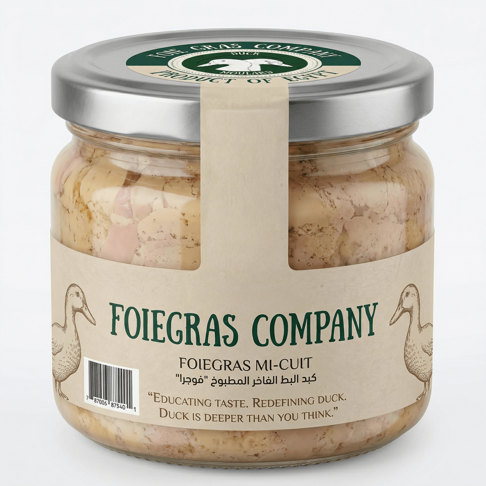
A full visual identity for Foiegras Company — Egypt's premium duck and foie gras producer. The system is built around an editorial duck illustration and a forest-green/cream palette that borrows from old French apothecary labels — heritage, craft, and a quiet kind of luxury.
Foie gras in Egypt sits in an awkward place: a French delicacy, made locally, sold to a market that doesn't have a strong cultural reference for it. The brand had to teach the category and own it at the same time — credible enough for a fine-dining buyer, warm enough for a curious first-time customer.
We anchored the identity in an editorial, almost botanical, illustration system: hand-drawn ducks on cream paper, deep forest ink, a serif wordmark. Cormorant Garamond carries the typography. The line ‘Educating taste. Redefining duck.’ became the brand voice — confident, instructive, never apologetic.
Foiegras Company now has a complete identity that travels from the jar label to the delivery vehicle. Each SKU (mi-cuit, pâté, confit, escalope, smoked breast, rendered fat) shares one recognisable label system, so the line reads as a family on the shelf before anyone reads a single word.
Concept
The mark is a circular seal — ‘Foie Gras Company — Product of Egypt’ wrapping a pair of moulard ducks. It's designed to read like an old preserves label: handmade, trustworthy, slightly nostalgic. The duck pair is the unmistakable signal; the seal is the certification of origin.
Color palette
A tight four-colour palette. Forest Ink (#1f4733) carries the type and the seal. Cream Paper (#e9dfc7) is the canvas — warm, paper-like, never bright white. Press Black (#1a1a1a) for body copy. Feather Grey (#bfb29a) as a quiet tonal accent on secondary surfaces.
Forest Ink
#1F4733
Cream Paper
#E9DFC7
Press Black
#1A1A1A
Feather Grey
#BFB29A
Typography
Cormorant Garamond as the system serif — elegant, editorial, with the heritage feeling of a 19th-century food label. Three weights: Bold for headlines, SemiBold for product names, Medium for body copy and the Arabic sub-headers.
Cormorant Garamond Bold
AaBbCc 123
Cormorant Garamond SemiBold
AaBbCc 123
Cormorant Garamond Medium
AaBbCc 123
Logo system
The seal is the primary lockup — used on every jar lid, on the back of the delivery vehicle, on stationery. A simplified single-duck variant is reserved for very small applications (favicons, app icons) where the full seal would lose legibility.
Brand in the wild
The system was rolled out across the full SKU range — Foiegras Mi-Cuit, rendered duck fat, pâté, confit, escalope, foie gras liver — and each product carries the same label architecture so the line reads as one family on the shelf.
Mockups
The brand was extended onto the delivery vehicle — the same forest green and cream, the same seal — so the brand arrives at the customer's door looking exactly like it does on the shelf.
More from the brand book
Related projects
We'd love to hear about it. Tell us where you are, where you want to be, and we'll map the rest.
Start a project