View project
Ta7wila
Doha, Qatar · 2025
Branding
Overview
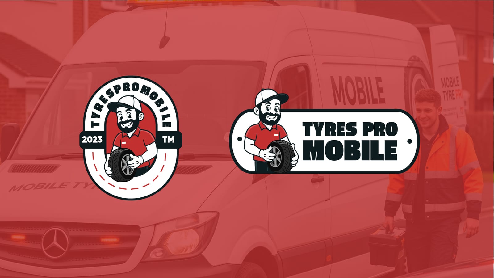
A full visual identity for TyresPro Mobile — an on-site tire service brand. The mark is built around a friendly mechanic character with a cap and work uniform, holding a tire — personal and warm, not corporate cold. Palette: tire red + mechanic navy + service white.
Automotive services all use the same visual cues (tires, tech marks, red/black). TyresPro needed a real personality — a character that differentiates the brand, a logo that works on the service van, the technician's uniform, and a social ad with the same clarity.
The whole concept revolves around the mascot: a smiling mechanic with a white/blue cap, orange/blue uniform, holding a tire. Two logo forms — a round Badge for official use and a horizontal Pill for vehicle wraps. Montserrat Black for visual weight. Tire Red #cb2222 as the signature that reads from across the street.
TyresPro Mobile now has a complete brand book: a 3-pose character kit, two logo lockups, a palette, and applications on the van, the uniform, and social. The character has become more recognisable than the wordmark itself — customers remember him before they remember the company name.
Concept
TyresPro Mobile provides fast, on-site tire services wherever the customer is. Installation, repair, maintenance. Smart mobile units deliver convenience, safety, and expert care on demand. The character is the face of the brand — a mechanic that tells you ‘someone trustworthy is showing up’.
Color palette
Just four colours: Tire Red for the bold roadside-grabbing signal, Mechanic Navy for the character and visual weight, Rubber Black for typography and high-contrast UI, and Service White as a generous background.
Tire Red
#CB2222
Mechanic Navy
#1F3170
Rubber Black
#1A1A1A
Service White
#F5F5F5
Typography
Montserrat Black/Bold as the system type — heavy weight that says ‘serious mechanic’. Reads on a service van from across a parking lot and on a worker's badge up close with the same legibility. Three weights: Black for headlines, Bold for sub-heads, SemiBold for body.
Montserrat Black
AaBbCc 123
Montserrat Bold
AaBbCc 123
Montserrat SemiBold
AaBbCc 123
Logo system
The brand has two logo forms: a round Badge for official uses (business cards, official documents) and a horizontal Pill (rounded rectangle) for vehicle wraps and banner ads. The character is present in both.
Brand in the wild
The system was rolled out across service vans, technician uniforms, business cards, and social media — every surface carries the character and the red. Customers see the van from across the street and recognise TyresPro before reading the name.
More from the brand book
Related projects
We'd love to hear about it. Tell us where you are, where you want to be, and we'll map the rest.
Start a project