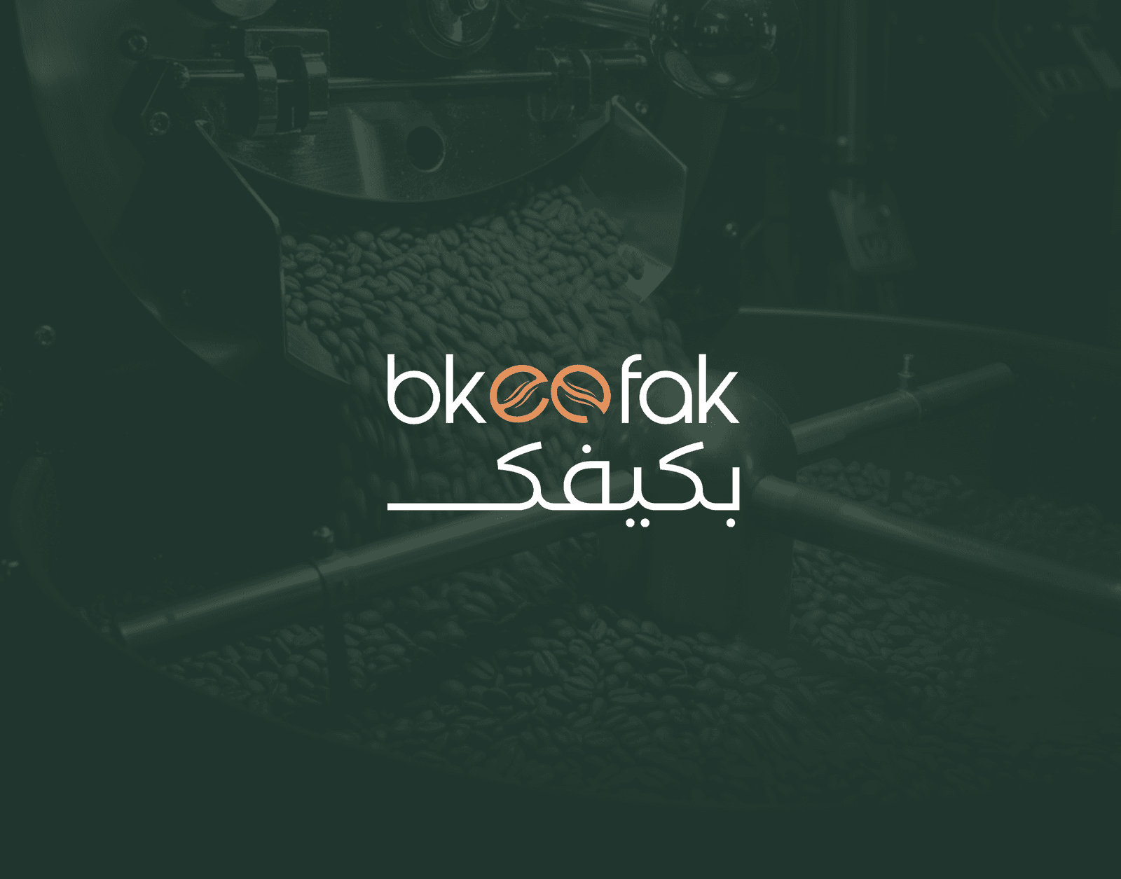
Bkeefak
Bkeefak — an Emirati coffee brand we built from zero: logo, packaging, campaign, and growing branches.
Before & after
Overview
Overview
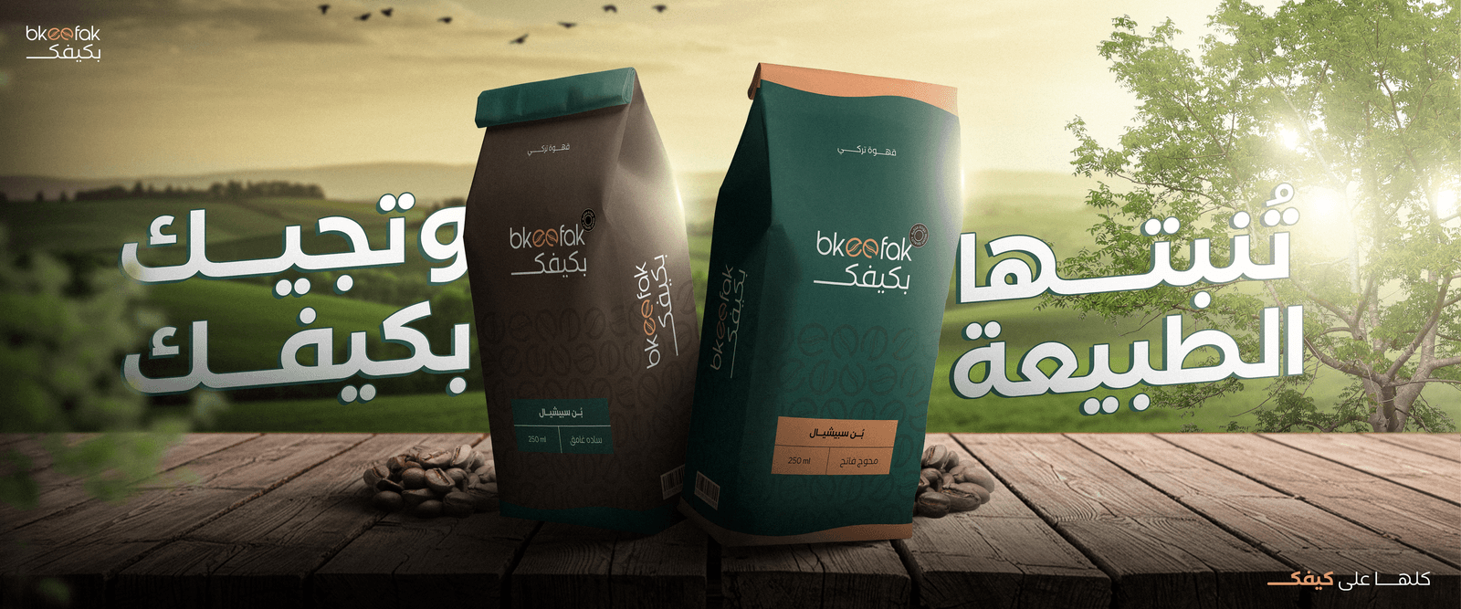
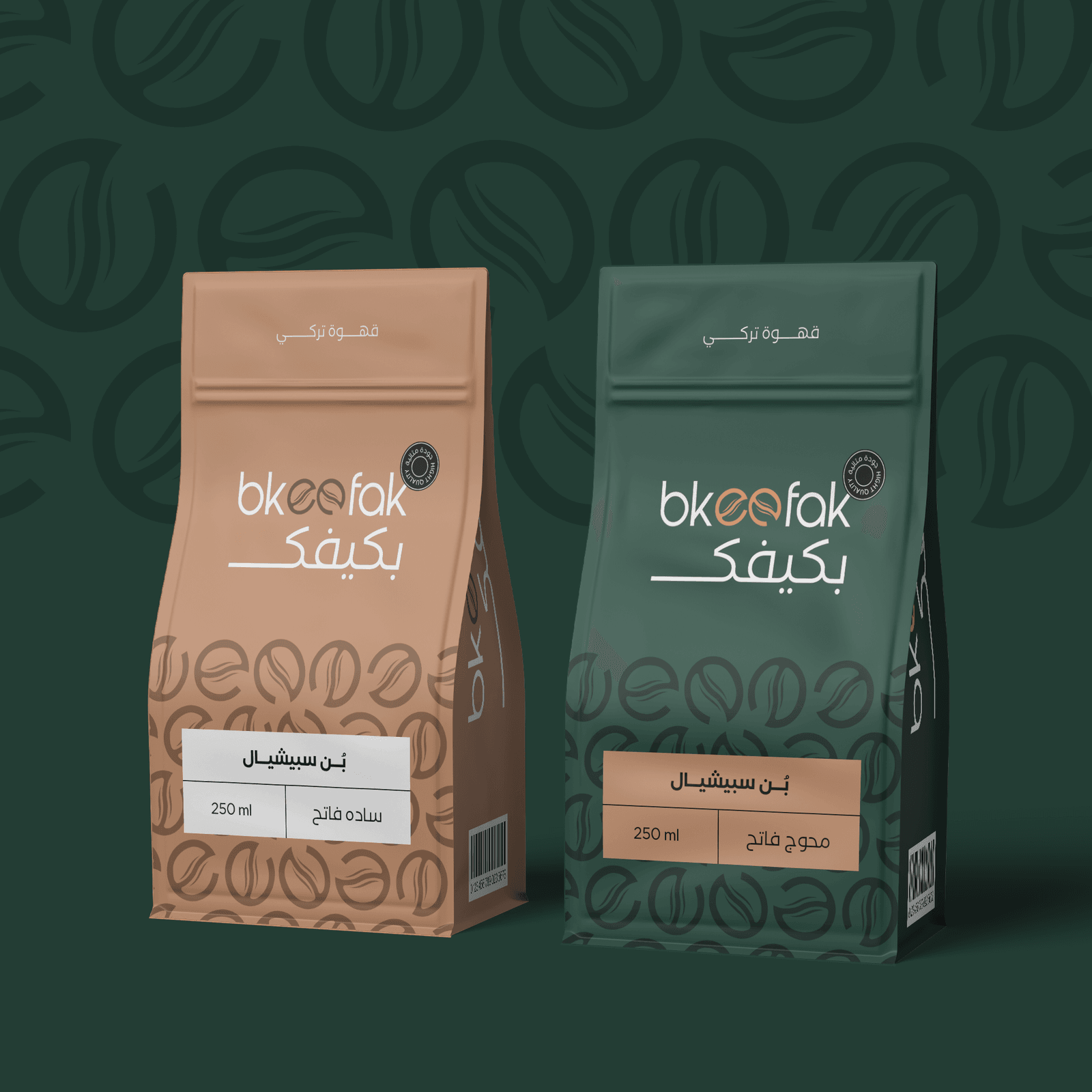
Bkeefak is a new Emirati coffee brand. We worked with them from minute zero: a mark of two coffee beans fused into an ‘ee’, a warm palette (forest green + roast orange + cream), a bilingual type system, and every piece of packaging and visual campaign they'd need to launch. The first branch opened with the brand felt on every touchpoint — from the street banner to the cup in a customer's hand.
The challenge
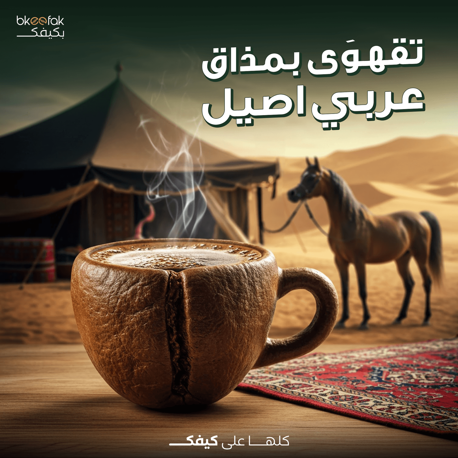
The Gulf coffee market is crowded — every new café tries to land on the same aesthetic (light green + wood + minimal). Bkeefak needed a warm, distinctly Arab identity — not a clone of global specialty coffee. And the packaging had to say ‘Bkeefak’ before you even saw the logo.
Our approach
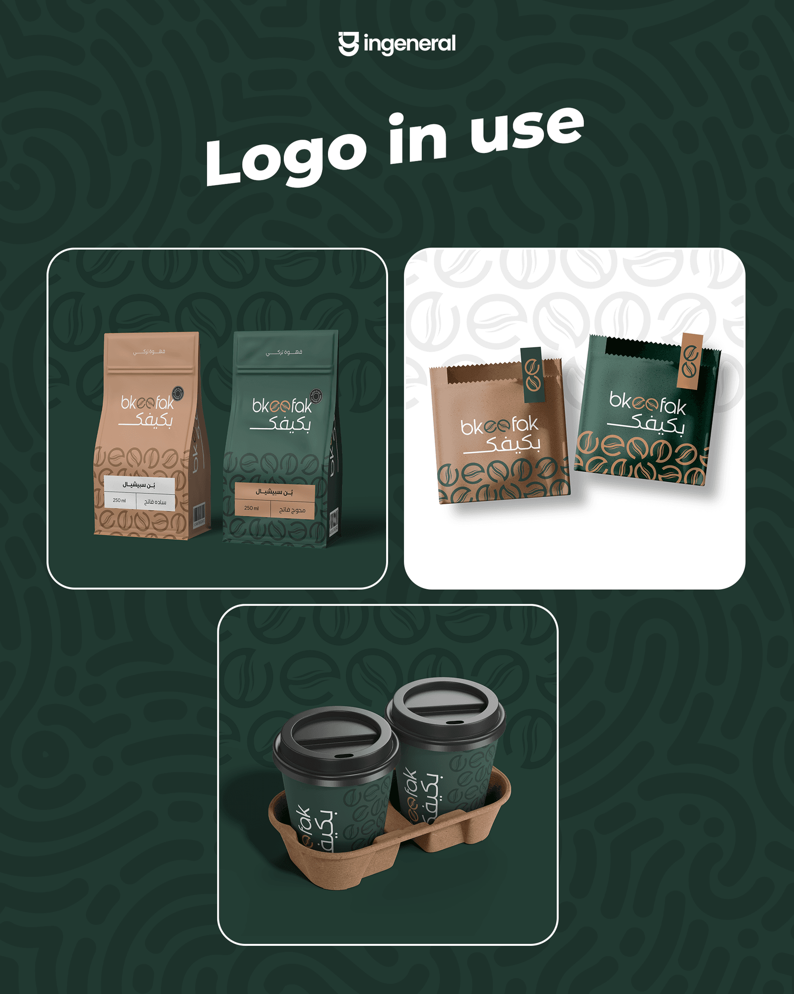
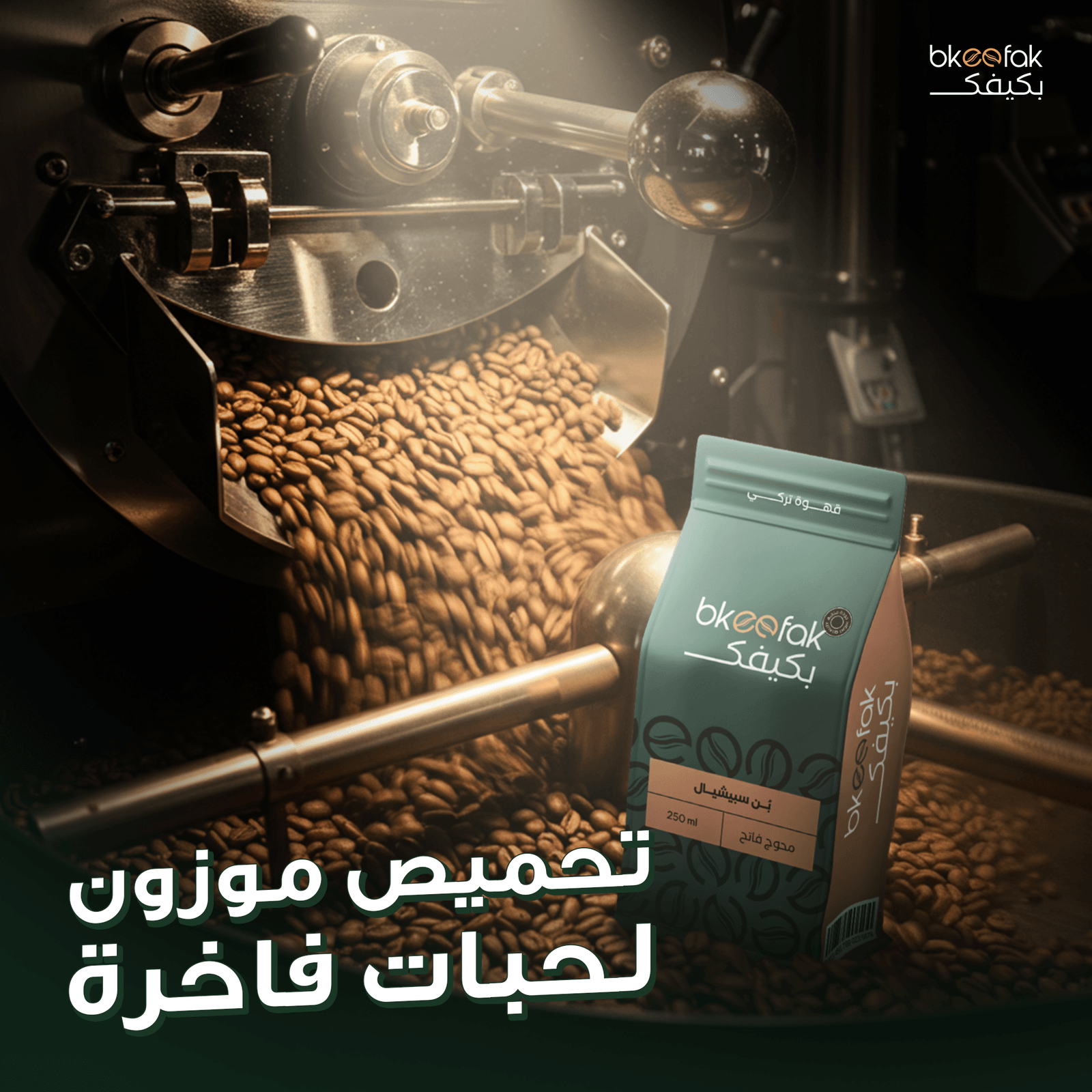
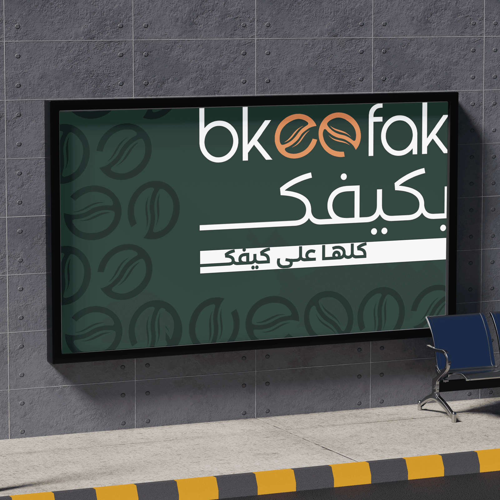
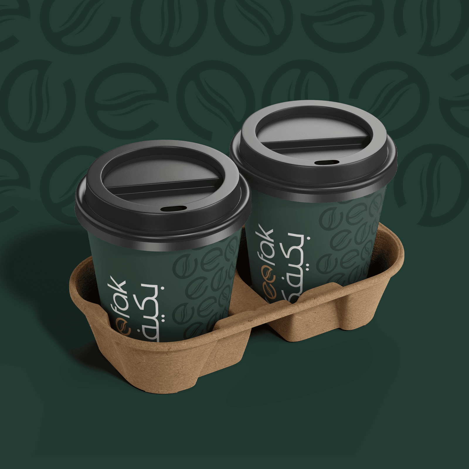
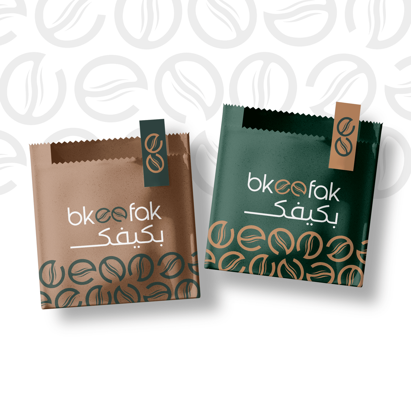
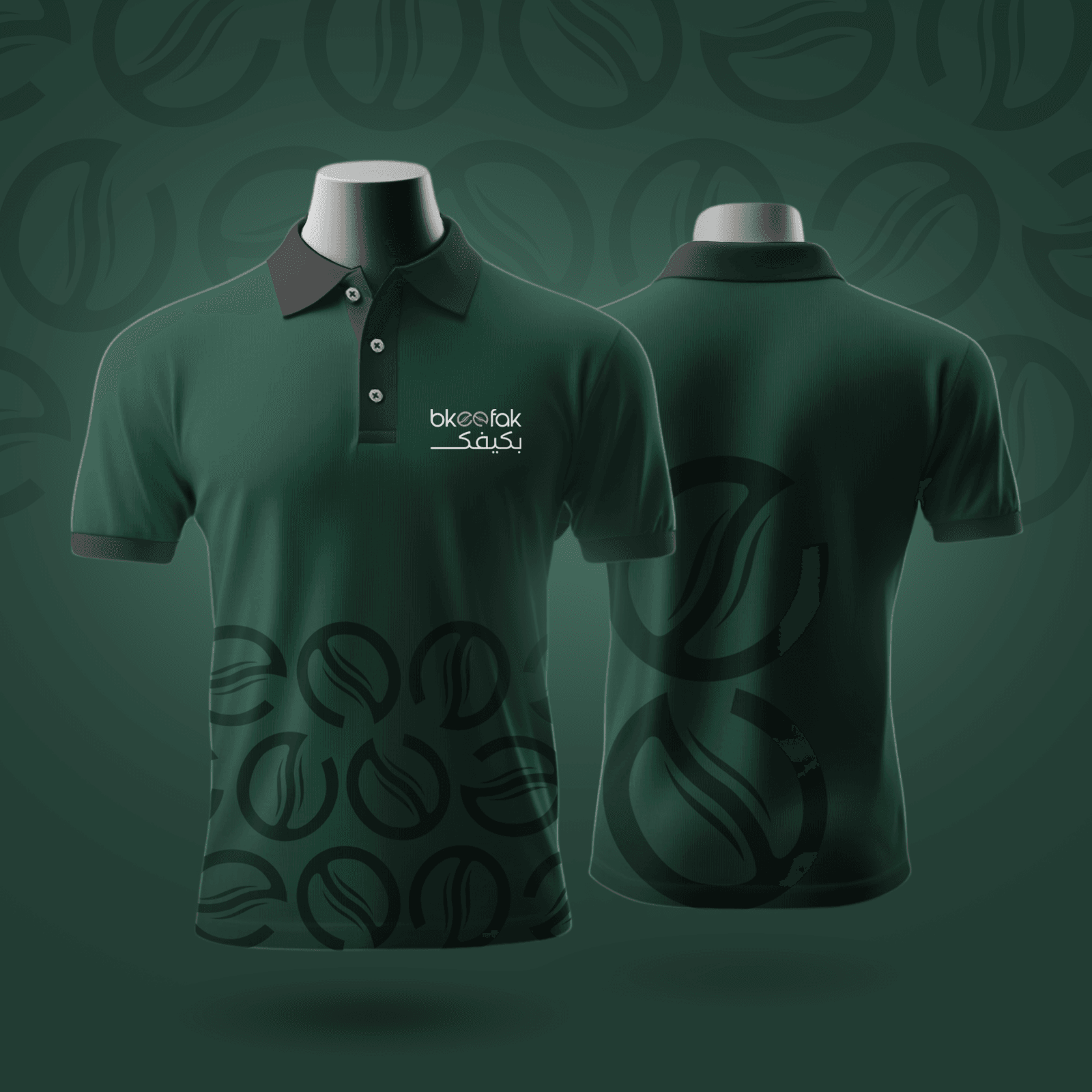
An identity with Arab DNA: a mark of two coffee beans forming the ‘ee’ in bkeefak, an Arabic type that reads as soft and friendly (not sharp/carved), a deep forest-green as the lead colour that says ‘ready coffee’. A 12-post launch campaign + a street banner + merch. Every piece of packaging carries the same language.
The outcome
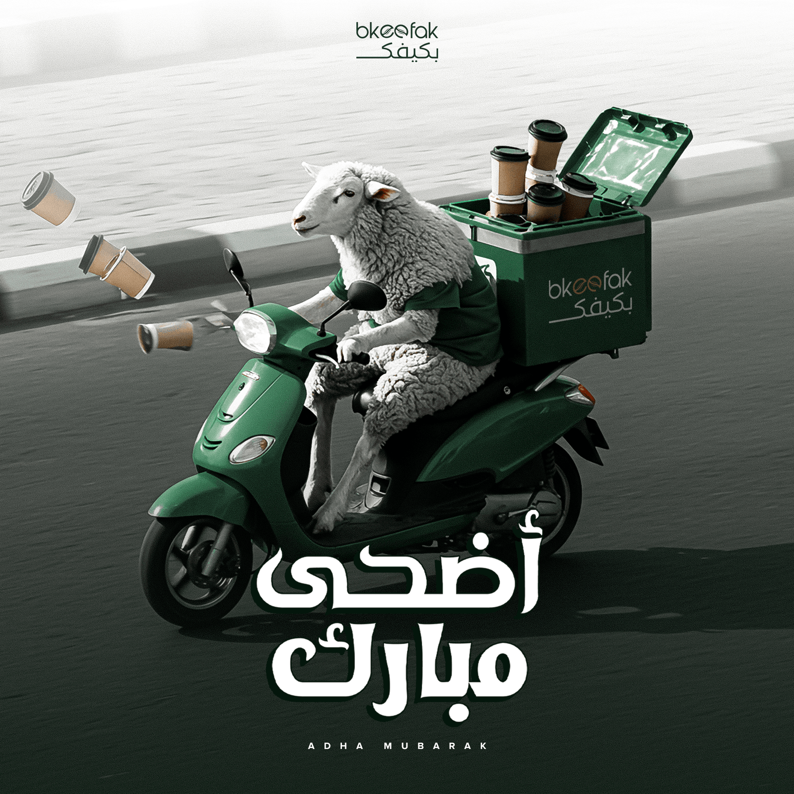
85K followers in the first year, 6 branches opened, an Eid Al-Adha campaign that reached 800K people in the UAE, and customers buying the merch (t-shirt + cup) before ordering coffee.
Before & after
Before & after
The numbers tell the rest of the story.
Instagram followers
Before us
0
0K
clients.case.metricLabels.branches
Before us
0
0
Engagement rate
Before us
0
0%
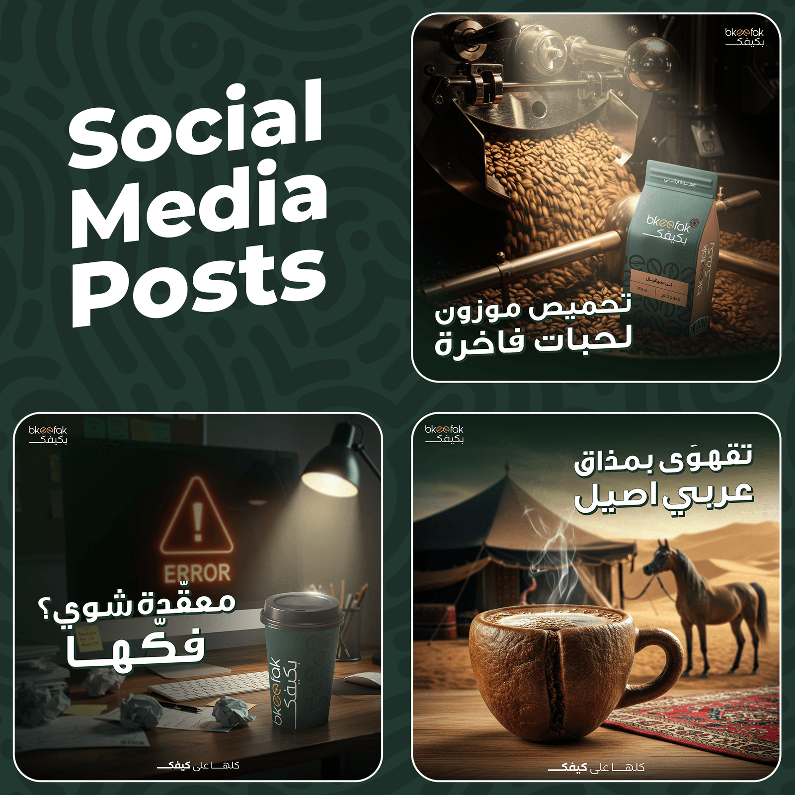
Content playbook
Strategy & plan
The strategy behind every post — pillars, tone, and a real content calendar lifted from our internal planning docs.
Section 01Strategy
- 01
A tangible mark
Two coffee beans fused into a letterform — simple but unmistakable. Reads at logo-on-a-cup size and street-banner size with the same clarity.
- 02
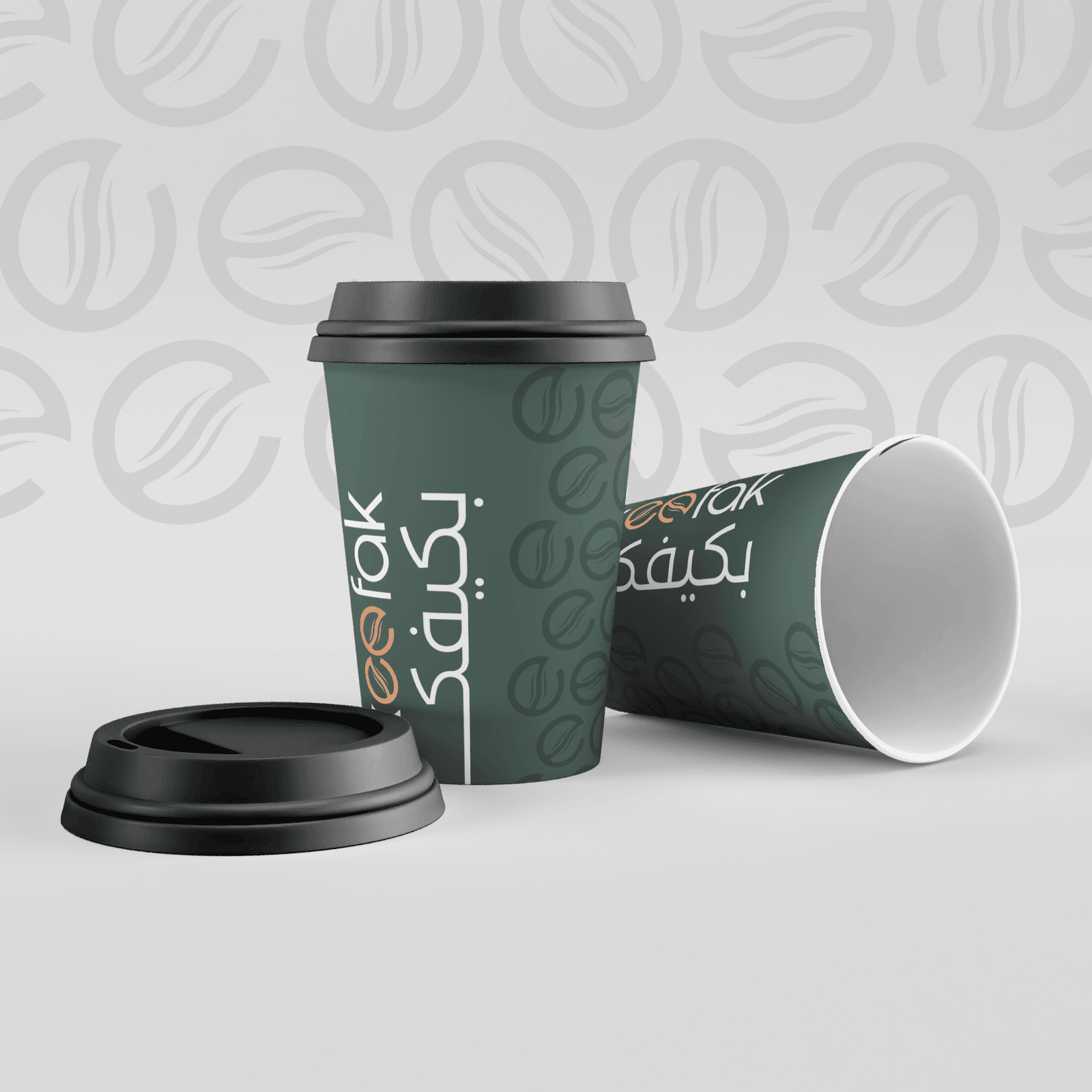
A packaging system
Cups, cup holders, bakery paper, bean bags — all in the same language. Walk into a branch and the brand is in every detail.
- 03
Cadence + seasonals
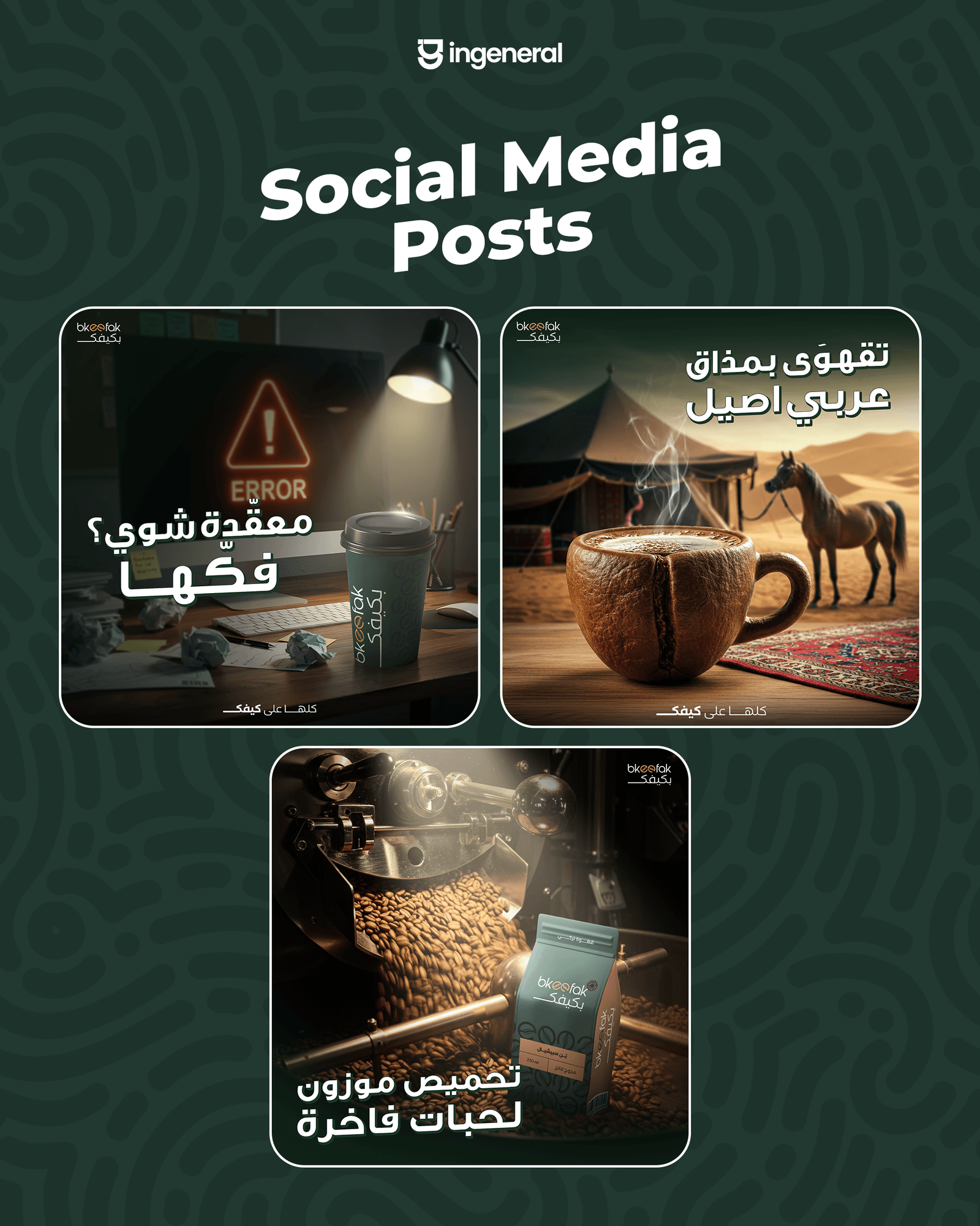
12 launch posts + seasonals (Eid, summer, Ramadan). The feed feels like a real café — not a one-off post every now and then.
Identity & logo system
Identity & logo system
The visual language we built for them.
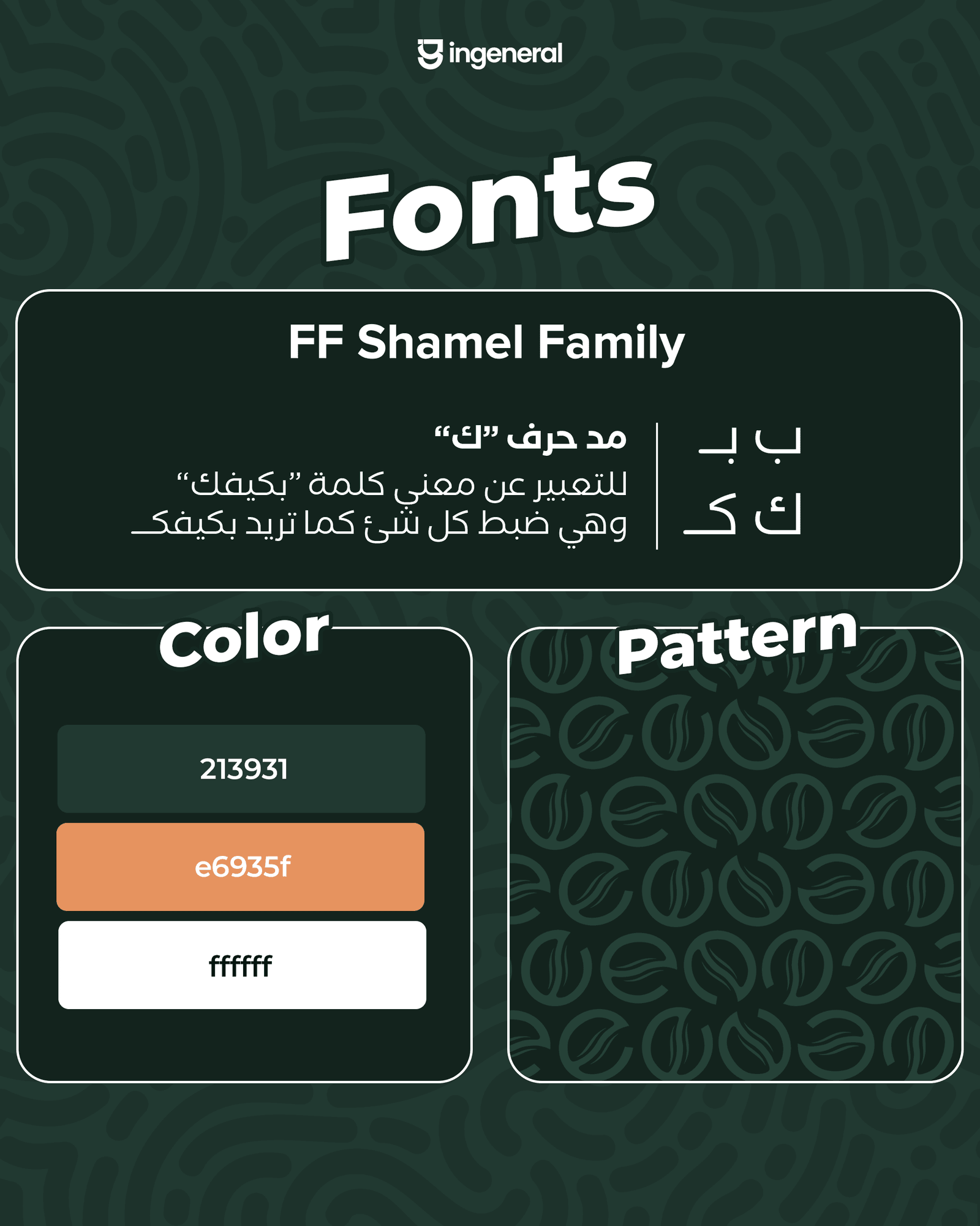
Logo system
Brand palette
Coffee Forest
#1F3D2E
Roast Orange
#E5944A
Cream Foam
#F5E8D0
Dark Bean
#2A2620
Social media designs
Social media designs
Templates and posts that carry the brand on every feed.
Social presence
Bkeefak
@bkeefak.coffee
Tangible work
Real things in real hands
Printed editions, packaging, merch — pieces that get held, not just scrolled past.
In their words
We gave them a name and an idea. They gave us back a full brand people were asking about before the first branch even opened. The packaging alone sold the place.
Bkeefak Founder
Bkeefak Coffee
Other client stories
Other client stories


Want results like this?
Tell us about your brand and your audience — we'll map a plan, and ship.
Start a partnership